How does my day look?

A day in the life of architect Le Corbusier:

Corbusiers days

This is one of the entries on an intriguing infographic by R J Andrews posted at infowetrust.com. It shows typical daily routines of some famous historical figures, displaying their work/recreation activities on a 24 hour chart.

Creative routines edit3

The two advantages of the 24 hour analog way of displaying time are that the entire day can be seen at a glance, and that time is displayed in context. Whereas a digital display tells you the time right now, an analog dial can show you the current time in the context of the surrounding time periods.

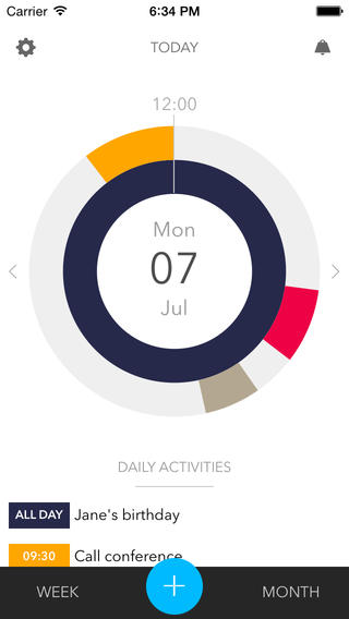
To use this kind of display to plan your time rather than record it, you could look for some suitable software, although there isn’t much around at the moment. One example I spotted recently is the CandooIt concept, currently available for iPhone and iPads, but perhaps planned for Androids soon, who knows. The idea is that your calendar and other plans can be shown on a circular chart, thus allowing you to see ‘at a glance’ what your day looks like.
Candooitscreen568x568

However, in its present form, CandooIt is difficult to use with an interface that’s both too minimalistic and confusingly animated, and it doesn’t really provide the features that you would expect from a basic calendar/planning app (such as reading from the built-in calendar…). Hopefully the author can improve the execution and make the concept work.
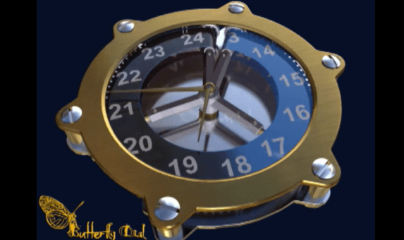
Butterfly Dial

The Butterfly Dial is an ingenious invention designed to combine both the 12 hour and 24 hour dials into a single 12 hour dial.

It’s much easier to see it in action than try to explain it:

butterfly dial

The video can be seen on YouTube.

It’s no substitute for a true 24 hour dial, but it’s a much neater solution than the Cyclos dial, described in the Design page of this site:

cyclos

DayTime for iOS

From the makers of DayTime:

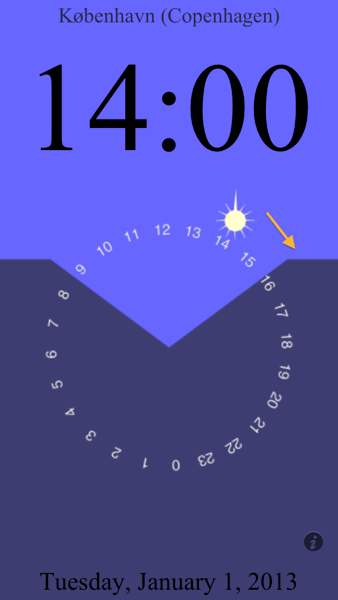
Imagine you are facing south, with the position of the sun marking the current time. Day and night are shown by the light and dark regions above and below. (24-hour day or night appear all light or all dark—try it by choosing Vadsø NO, or the US Amundsen-Scott South Pole Station!) Sunrise and sunset positions are marked where night meets day, and the amount of daylight remaining is the arc from the sun’s position to the sunset line (arrow).

daytime

For example, at 2:00PM on January 1st in Copenhagen, there were less than 2 hours left of daylight—but without computation one can intuitively see very quickly that the short winter day is almost over.

You can download DayTime from the App Store.

Van Cleef & Arpels Complication Poetique Midnight Planetarium watch

At $ 250,000, you probably won’t be able to afford the new Midnight Planetarium watch from Van Cleef and Arpels, but you will be able to enjoy this beautiful video of it for free:

As described by pocket-lint:

Not only is it encased in 18ct rose gold and sport double sapphire crystals, it features six of the planets of our solar system orbiting the Sun in real time.

Each of those planets – Mercury, Venus, Earth, Mars, Jupiter and Saturn – is itself represented with a precious stone. Aventurine, serpentine, chloromelanite, turquoise, red jasper, blue agate and sugilite have been employed to double as the planets and stars. The Sun is a similar rose gold to the frame.

The strap is made of alligator leather, but beyond the materials used, it is the mechanism inside that is truly spectacular. As each planet orbits the Sun in real time, that means some of them move very slowly indeed. For example, while it will take just three months for Mercury to complete an orbit, Saturn will take 29-and-a-half years.

You can see why Van Cleef & Arpels has stopped at Saturn. Uranus takes 84 years to complete an orbit, while Pluto takes 248. There’s little point having a dial on a watch that you are unlikely to ever see rotate.

Jaquet Droz – The Grande Heure GMT

The Grande Heure GMT from Jaquet Droz has two hands, but both of them are hour hands.

Grande Heure

From the description:

Never before has a watch presented such a clear, effortless indication of two time zones. This technological development is enhanced by the majestic hands in the form of a compass, a detail which hints at the navigational instruments used by sailors of another era. The red hand indicates local time while the blued steel hand shows the time at the destination. When the two hands come together in the same time zone they merge into a single, bicolored indication of the exact time.

How much does it cost? Well, if you have to ask, you can’t afford it. (About $25,000, I think.)

Average Days from Mr Jones

I noticed that Mr Jones also made this 24-hour watch, the Average Days model, reminiscent of the Swatch watch, which had the similar idea of showing what you’re up to at different times of the day:

Watches

The dial of this watch visualises statistical research into how the average person spends their time. The slot on the hour-disc shows what the average person is doing at that time of the day. You can see at any time how you measure up to this notional individual. 

Professor Jonathan Gershuny, the Director of the Centre for Time Use Research provided us with an updated and customised data set for the activities mapped to the different times of the day for this watch.

It’s another limited edition, so hurry!