This page looks at some of the design aspects of the 24 hour analog dial.
Advantages
What are the advantages of the 24 hour analog watch and clock dial?
-
you can see the whole day at a glance
-
they’re good for displaying world times – no problem about am or pm, fast or slow – you can see that London and Wellington times are 12 hours apart.
-
you can tell whether it’s day or night without looking out of the window – useful for submariners, miners, polar explorers, and space travellers
-
they prevent ambiguous readings: ‘is that 3 in the afternoon or 3 in the morning?’
-
the hour hand reminds you of the (apparent) rotation of the sun around the earth
-
they are unusual, and very collectable
Should noon be at the top or bottom?
This is one of the major variations in design: where to put noon and midnight? (This is an issue for most 24 hour clocks and watches, although with a few watches you can wear them either way up, so the design doesn’t matter.)
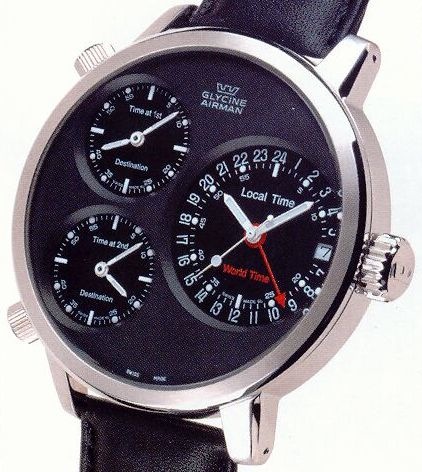
Typically, more modern designs place midnight at the top. The old medieval clocks probably put midnight at the bottom. This is the famous Glycine Airman watch:
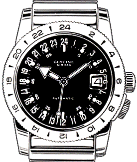
To be fanciful for a moment: the ‘noon at the top’ fans like the literal representation of the day – the fact that the rise and fall of the day (from the depths of night to the dizzy heights of noon and back down again) and the motion of the sun are echoed by the motion of the hour hand through the dial. But the ‘midnight at the top’ fans like the idea of the day starting at the beginning, at the top, where stop watches and countdown timers – and minute hands – also start. Or perhaps they feel that things start looking up as the evening wears on! Are there other reasons?
If the 24 hour dial is an analog, what exactly is it an analog of? Here are two diagrams trying to explore the differences between noon at the top and noon at the bottom. These are just mental pictures on my part, not accurate diagrams – please explore your own ideas!
First, this is the noon at the top design. The observer is looking south towards the sun and watching it go round the sky clockwise. The hour hand is pointing to the sun all the time:

And the next diagram shows the noon at the bottom design. The difference here is that we’re now hovering above the earth, looking down.
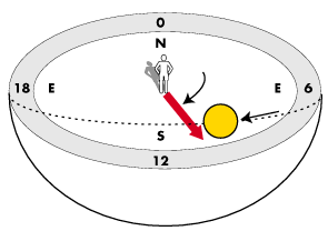
If you visit André’s 24 hour watch site, you can vote for your preferred design. Most modern 24 hour analog clocks and watches are ‘noon at the bottom’ designs, although you can find a few ‘noon at the top’ designs.
Historical note It’s not easy to tell sometimes whether noon is at the top or the bottom of older clocks that use the double-XII system. My feeling is that makers usually put noon at the top (to imitate the apparent motion of the sun) until the minute hand became popular. Because the minute hand usually puts 0 at the top, it made sense to start counting the hours from the top as well, and so midnight (hour 0) gradually moved to the top. Or was it the influence of the compass?
Numbering
On a 12 hour clock face, the hour and minute markers (if present) can share some of the same positions: this is because 60 is divisible by 12, and each hour mark coincides with marks that mark multiples of 5 minutes. However, on a 24 hour face, the odd numbered hours don’t coincide with any minute markers (they appear at the 2 and a half minutes past position, 7 and a half minutes past position, and so on). For this reason, and because it allows you to have larger numbers, many dials show only the evenly-numbered hours.
My Raketa watch (I bought mine from http://www.russiansouvenirs.com for $US30) has a different solution – put the odd-numbered hour figures over the 2.5 and 7.5 minute points, and use large hour markers instead of even-numbered digits.
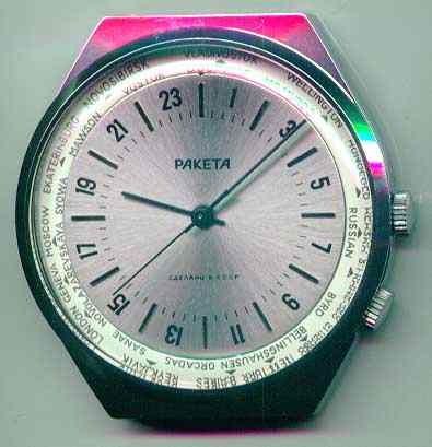
This means the minutes are clearly visible, and the hours can be observed or deduced easily enough.
World times
The 24 hour analog dial is ideal for exploring world times.
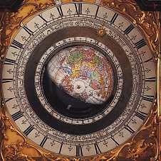
One technique is to use a map or globe for showing times in various places in the world. Sometimes, the map or globe hemisphere is dynamically divided into a light half and a dark half to point up the day and night contrast. There are examples in the history section on this site. At a glance you can distinguish between night and day – which is also useful if there are no numbers.
The Raketa watch shown above also has a second knob, which turns the outer world time ring. So you can align London to the hour hand, then read off the time in, say, Vladivostok. However, it can’t now show half the dial in black, half in white (to suggest day and night). (More on this subject elsewhere on this site.
Another way to display different time zones is to limit the design to showing just two or three (or four).
Perhaps the brand new Glycine Airman watch has as many dials as you really need?
Not so good ideas
There are some design ideas which I personally find less satisfying.
Consider this Alessi watch, which seems at first sight to be a good honest 24 hour watch:

However, the two hands indicate 12 hour time: only the separate 24 hand pointer shows genuine 24 hour time. Nothing wrong with this, of course – there are many such dual-function watches around (perhaps they will help people evolve from 12 hour time to 24 hour time), but I think this design, with no indication of the dual nature, is misleading.
Here’s another interesting idea that has recently emerged.
This is the Cyclos watch, whose hour hand moves in and out away from the centre, following a path from the inner 12 hour dial to the outer 12 hour dial and back again as it rotates, thus distinguishing between the two 12 hour cycles of a 24 hour day. The Cyclos web site has a Flash animation – nice work.
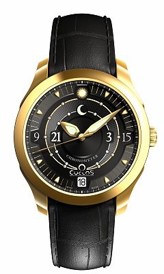
According to John Ermel, the managing director, the standard 24 hour watch, as shown elsewhere on this web site, is ‘just not intuitive’. Yes, but … what do you think those numbers mean: is the ’15’ hours, minutes, seconds, or the date? And what’s the 18: the date? the hour?
Note also the use of the sun and (unchanging?) moon icons. This will bother pedantic types who will want to know where they can see the crescent moon overhead at midnight.
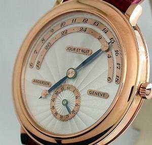
Yes, it’s ingenious and beautiful, but – to my way of thinking – plainly the wrong solution. It’s really much easier to switch to a 24 hour dial, which is surely more intuitively ‘right’, if a little less of an ingrained habit for most of us. For an equally ingenious, but simpler and wittier version of the idea, consider this example from Swiss manufacturer Andersen.
The Jour et Nuit model is a 24-hour watch with jumping hour and off-centre minute display. When the minute-hand points to 60 minutes, the big two-sided hour-hand jumps forward to the next hour. The day-time hours are displayed by the longer hand, decorated with a sun, and the night-time hours by the shorter section illustrated by the moon.
You can find a more affordable version of this watch at the Russarmy.com site. (Thanks to Wee Meng Lee for finding this!)
Circles and design
The primary intuition behind the use of the 24 hour analog face is that a simple shape – the circle – is taken to represent a whole entity – the 24 hour day. I’ve recently been reading Reinventing the wheel, by Jessica Helfand, a fascinating exploration of some aspects of circle-based information design. She starts the book thus:
The circle has no beginnning and no ending. It is unbiased, solid and unwavering in its geometric simplicity, denoting unity and eternity, totality and infinity. It represents the image of the cosmos, the cycles of the seasons, the life of man and the orbits of the planets around the sun. […] Over time and across multiple cultures, the circle has come to represent an ideal of unsurpassable perfection: it eludes mathematical exactness, thereby reminding us that nothing is exact, even in mathematics. In this manner it is the essence of all that is natural, primordial, and inescapably human.
- excerpt from Reinventing the wheel
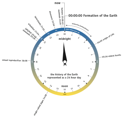
Once you see this inevitable correspondence between the whole circle and the whole day, you’re liable to get confused by some of the current information design out there, when it’s based on the 12 hour dial. For example, I was recently looking through the London Science Museum’s geology display: to explain the chronology of the Earth, a clock face was used. According to the design, life on Earth started to develop at 3:00, which was duly shown graphically on a 12-hour clock face (hour hand only). But what was the circle representing? Was this 3:00 in the afternoon or the morning? While your brain was telling you that life started about a quarter of the way through history, the designer may have been telling you something different – I couldn’t tell either way, without a graphical indication of am/pm, which wasn’t provided.
Here’s my version of what this concept would look like when interpreted on a 24 hour analog clock. It works well, in that the recent explosion of life is clearly demonstrated. . (This is a re-interpretation of a picture in the book Cradle of Life, by J. William Schopf.)
Once you’re aware of the problem, you’ll notice it everywhere: one person’s clock face is another person’s pie chart – and one of them is sure to be wrong – unless they’re both aware of the 24 hour analog clock face.
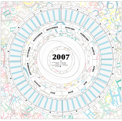
Another main time cycle is the year, so of course representing the year in a circle is another obvious idea, as yet relatively unexplored. Here’s something I created a couple of years ago and update occasionally:
Some preliminary excursions into cartography
Most of the 24 hour analog clocks with world maps are European. For us Europeans the sun appears to travel clockwise through the sky, which is probably why the hands of clocks and watches rotate clockwise, since the hour hand was originally, either literally or metaphorically, pointing to the sun. This is probably a convention that was adopted when the first mechanical clocks with dials were developed, if not earlier. (I doubt whether the conventions derives from the use of sundials: on a vertically-mounted sundial, the shadow of the gnomon moves counterclockwise around the dial.)
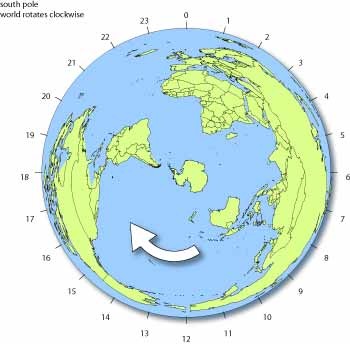
But of course it’s the earth that rotates, and it isn’t really rotating clockwise. If you hovered above the North pole, you’d see the Earth rotate counterclockwise beneath you. If you hovered over the South pole, however, the Earth would rotate clockwise.
The difficulty with using a flat view of the Earth is the problem of accurately representing the 3D surface in two dimensions. We’re used to the biased view of the Mercator projection:
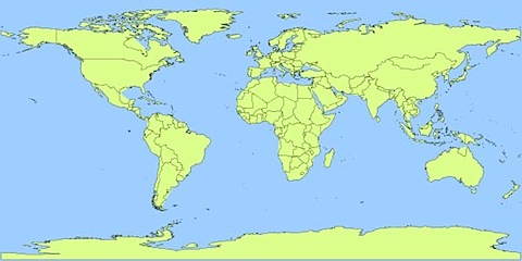
This is well known for exaggerating the size of Europe and North America at the expense of other continents. You can use an azimuthal polar projection to show most of the landmasses. Here’s the view above the North pole.
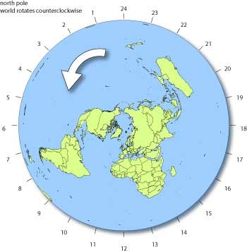
The hour number are fixed in position around the anticlockwise-spinning earth. With such a clock you’re telling ‘natural’ time. The sun is located below the 12:00 position, so the time here is 12:00 noon GMT or UTC – about 07:00 in New York, and 22:00 in Australia. (Our system of time zones defies geographic reality, and means that natural time and civil time don’t always coincide.)
The view from the South pole is also interesting. From this angle, this earth clock seems to rotate clockwise.
Using a globe – or half a globe – is a better solution. On the Think the earth watch, the numbers are fixed, and the (northern) hemisphere rotates counterclockwise, like a big hour hand.

Alternatively, you could construct a clock consisting of a stationary picture of the Earth, with the numbers rotating around the edge, but this is not often used.
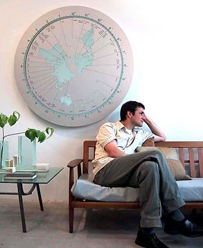
Here are some examples of map projections used in clocks. Here’s the Simple World Clock Dashboard widget for MacOS X:
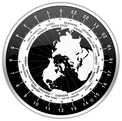
This is the ‘This is It’ world clock:
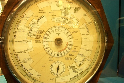
This clock in London’s Science Museum takes a more diagrammatic view of the Earth:
Thanks for this article! I just bought a 24 hour watch and am waiting for it to arrive. It’s a 24 at the top design, but as I’ve looked at others, I see why a 12 at the top makes sense, too.
Thank you so much for this. You are geo-tempo nerds after my own heart!
Love your blog, especially this page with the maps. I’ve just been working on a polar projection map clock myself and your page was really useful in the discussion.
http://ferkeltongs.livejournal.com/36976.html
Thanks Tim – you made the front page as well! 🙂
Check out today’s XKCD: http://xkcd.com/1335/
@tim nice! A South Pole view for a change.
Nice article! I prefer 12 at the top myself, but with 12 at the bottom, the hour hand mimics the shadow of a sundial (more or less, assuming solar noon is anything close to 12:00). For this reason I would have guessed that the earliest 24 hour clocks would have been 12-bottom. I like to think about if Australians (Aboriginals) had invented clocks, they’d all be anti-clockwise. I have yet to find a 24-hr anti-clockwise watch, but I live in the northern hemisphere so I guess I’ll survive.
I’ve been looking at watches all morning instead of working, sheesh. I’m wondering if the Raketa watch minute hand goes around once in an hour. I saw something somewhere about a 24-hour watch with a minute hand that went around once every two hours. In any case, cool to see other people are aware there are 24 hours in a day…